INTERIOR DESIGN BY KATIE FEROLA
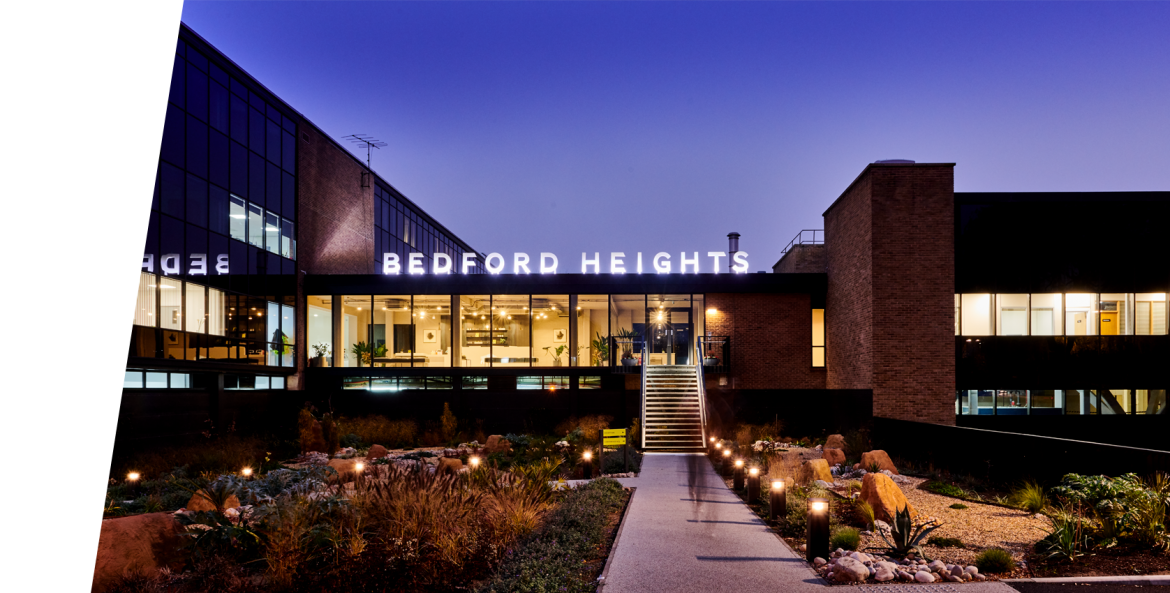
A Texan, midcentury design with a contemporary twist. The interior design of Bedford Heights, created by Katie Ferola, encompasses all these elements, cleverly bringing together the vast space into a beautifully designed building enjoyed by hundreds of people every day.
Over four years, Katie Ferola designed all the shared facilities including Graze Café, the lounge, reception and the conference and events area, as well as working closely with garden designer Graham Pavey and gardener Dave Boyd on the redevelopment of the four courtyard areas and the impressive Texan riverbed garden.
Katie’s creativity has produced a building which leaves a lasting impression on visitors and a space which has given Bedford a unique legacy to this iconic building, known by many local people as the former home of Texas Instruments.
GRAZE CAFÉ
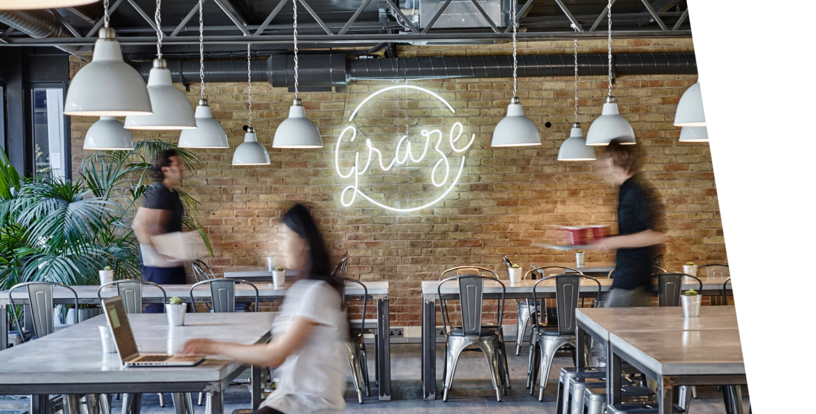
Katie’s vision for Graze was to create a space where people could enjoy their time away from the office, meet up with colleagues and visitors and, more importantly, would want to return.
Her inspiration for the name Graze came from Bedford’s origins as an agricultural market town for the surrounding region, with sheep being the main livestock and wool a significant industry during the Middle Ages. Graze seemed apt and also fit in rather nicely with the Texas Longhorn murals she installed later on during the project. Along with the giant cacti, these design touches bring a bit of Texas back to Bedford, and also add a little humour, with the Longhorn appearing to watch people graze whilst they do.
With the building originally built in the early 1960s and made of concrete, steel and brick, Katie chose natural materials for the interior keeping the style raw and simple to bring it up to date.
Katie sought out a solo craftsman called Daniel who made bespoke table tops from polished concrete and table legs made from steel, which provide a pleasing contrast to the exposed brick wall that runs the width of the café. Daniel also crafted matching benches and Katie mixed in some Xavier gunmetal steel French bistro chairs and stools.
The white neon Graze sign hangs on the brick wall and gives the space a subtle American diner feel.

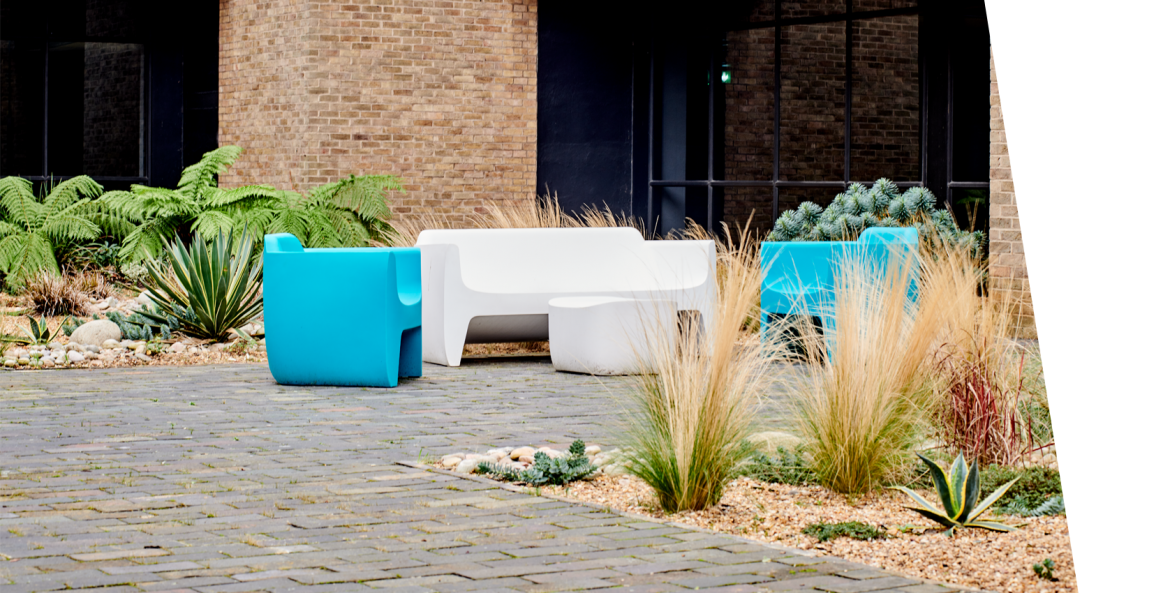
The café is further enhanced by its own large courtyard. White picnic benches with complementary black parasols and funky plastic sofas in turquoise and white provide space for people to dine and relax alfresco, amongst border planting and large wooden planters.
Katie loves seeing the café busy and used for morning, lunch and afternoon breaks, with our resident businesses using the space to relax in, in an environment made for them to enjoy.
LOUNGE
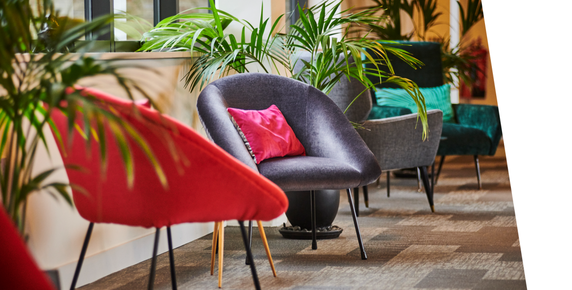
Once the café was complete, Katie’s focus shifted to other areas within the building, specifically creating a lounge area. With the combination of Bedford Heights’ 1960s origins and the building’s current owner’s interest in midcentury design, Katie felt this area was calling out to feature furniture from this period.
Katie quickly set about researching different pieces from around Europe and soon got hooked on Italian midcentury with all the style, flair and elegance you would expect from one of Europe’s design powerhouses. The majority of the furniture is original, mostly Italian pieces sourced from antiques dealers with a few items from eBay.

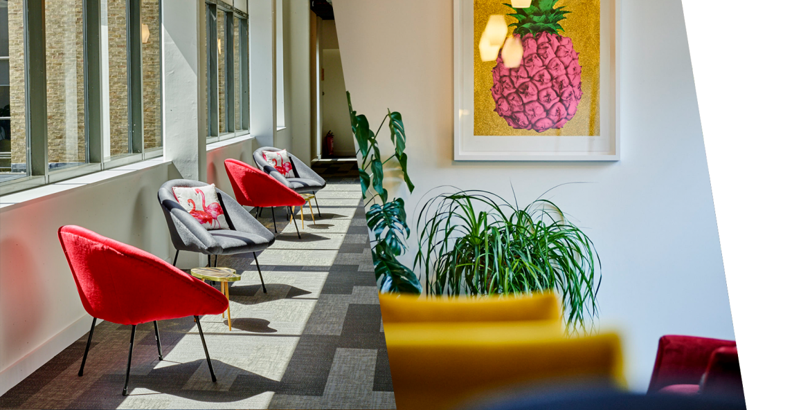
All the seating was reupholstered to give it a more modern and contemporary feel using luxurious fabrics including velour, velvet, felt and tweed.
The ceiling was left exposed and sprayed in a Farrow & Ball colour, Hague Blue, chosen to create warmth and a calming atmosphere. The ceiling lights feature three long midcentury white glass pendants adding a homely touch.
The flooring is a wonderful product called Bolon, a vinyl weave tile which creates varying textures and colour when laid in different directions.
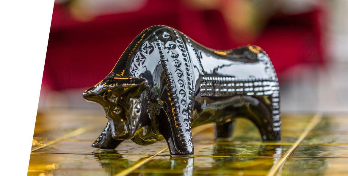
Adding a variety of bold, shiny green tropical palms and cheese plants really brings the room to life whilst the majestic black midcentury matador ornaments reflect Bedford Heights’ logo and adorn the window sills.
The elegant sweetheart shaped mirrors add interest and reflection and the 1950s sunburst clock on the wall is a reminder of that era, and a practical reminder of the time for those who are enjoying the relaxing atmosphere a little too much.
The lounge also benefits from another refurbished courtyard, with Katie adding the same vibrant plastic seating as the café courtyard but this time using different colours in lime and slate grey, the Bedford Heights corporate colours.
CONFERENCE & EVENTS SPACE
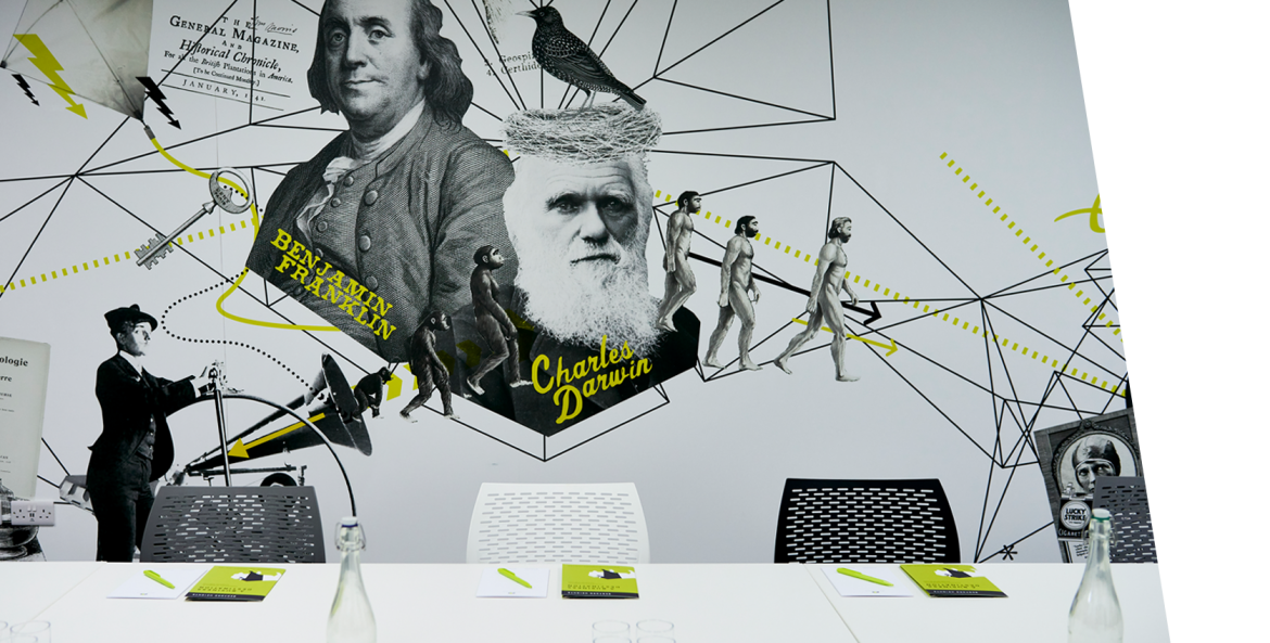
Katie’s brief for this area was to maintain a corporate feel in keeping with a slick and professional looking conference space. Along one wall is a giant mural, an idea of the current owner and further developed, designed and installed by design agency Run for the Hills, featuring various male and female philosophers, inventors and pioneers including Jack Kilby from Texas Instruments who invented the first integrated circuit. Sansevieria plants in contemporary troughs were added for colour and life.
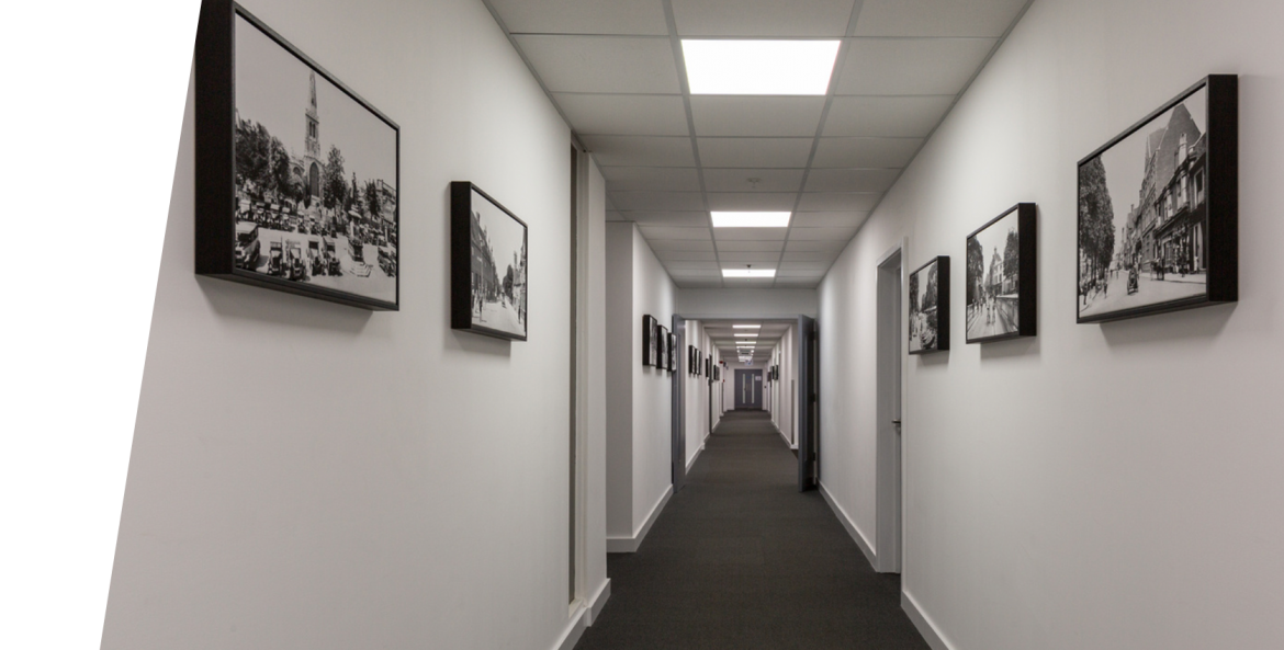
The long hallway leading to the conference centre was uplifted with black and white canvases of Bedford through the ages, selected with help from conference manager Mandy Bolam. The canvases have become a real talking point with occupiers and visitors stopping to admire the images of a bygone era and reminisce.
RECEPTION
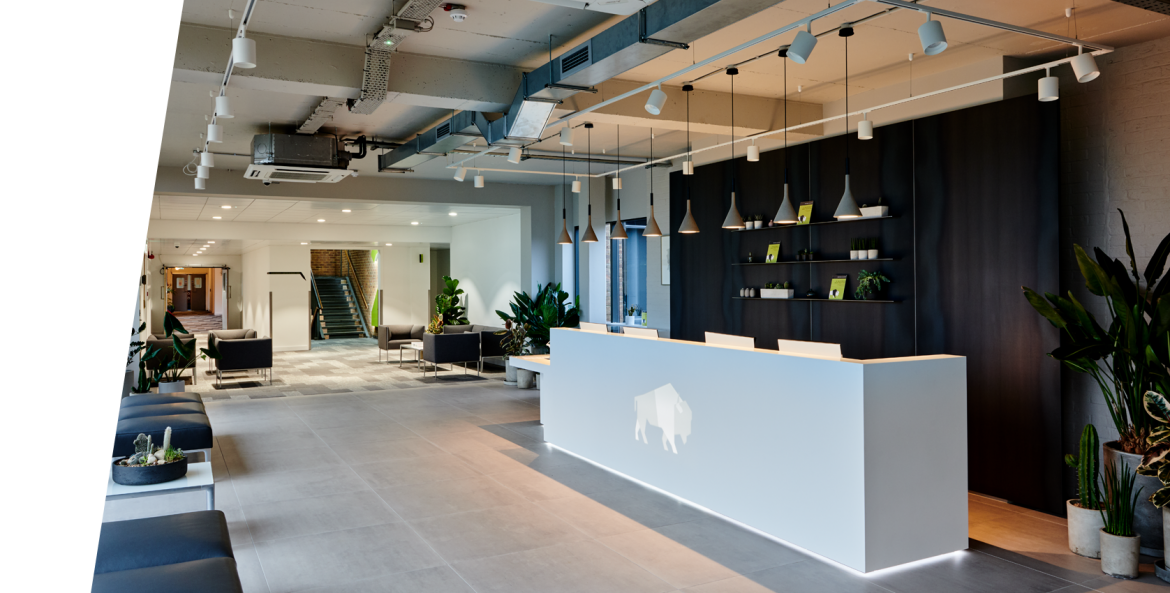
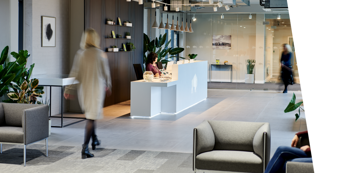
Katie’s final interiors project at Bedford Heights was the reception, transforming a dated, tired room into a hugely impressive, light filled space giving resident business and visitors a warm welcome every day.
Katie had a clear vision for the new and improved Bedford Heights reception, centred around using natural materials to enhance the incredible natural light. With one large wall of glass, two large windows and two doors leading out to the main entrance and third courtyard area, reception is arguably the best space in the building with a stunning view of the riverbed garden.
Katie chose 90 x 90 Mosa Porcelain tiles with a concrete look, giving the space a feeling of even bigger expanse and depth, and tying in nicely with the concrete exterior giving it a modern finish. Complementing the flooring, Katie commissioned a bespoke Isomi Reception desk made of white composite for a fresh, clean and contemporary look.
Set within the middle of the desk is the Bedford Heights Bison, subtly illuminated which enhances the piece and lifts the room.
Behind the desk, four beautiful steel panels with elegant slimline shelving accommodate various mini concrete potted cacti bringing life to the steel. Above the desk are eight concrete lighting pendants which add an architectural element as well as providing direct task lighting to the desk.

The walls are painted in a soft Farrow and Ball colour Cornforth White and the two paintings on the walls are from the delicate and intricate works in the Sediment series by Simon Williams of JakBox, which were inspired by the residue left behind from muddy water creating vein-like patterns.
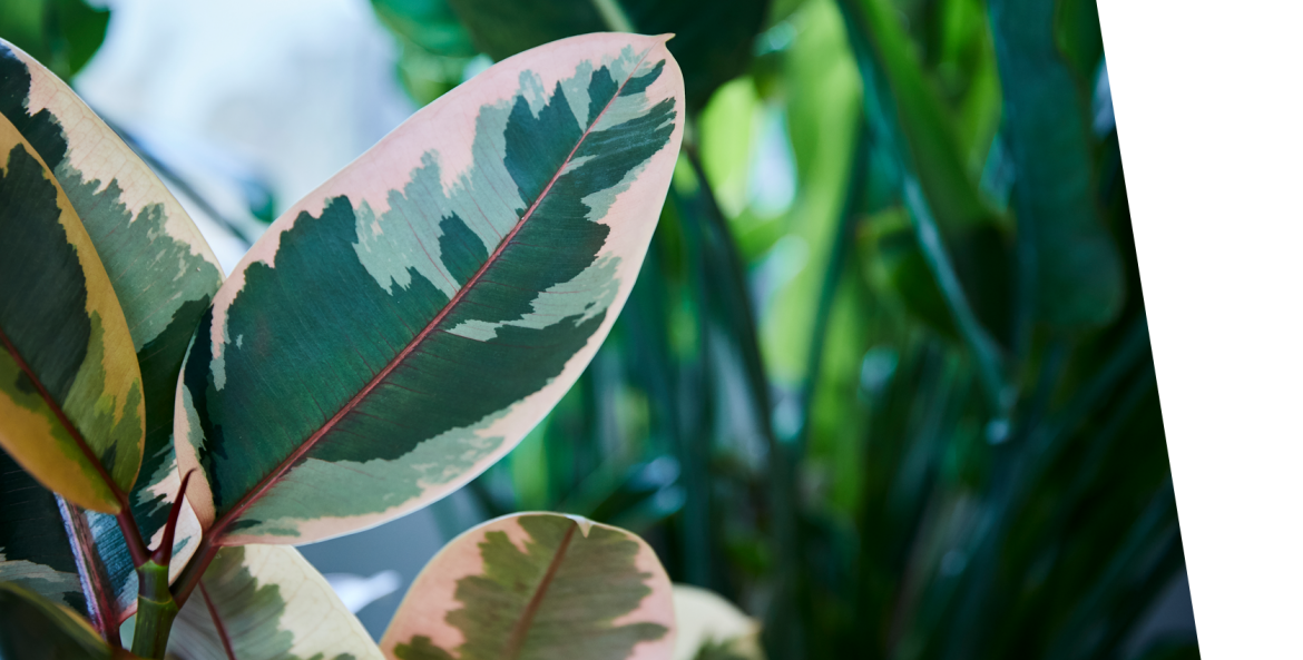
There are numerous large concrete pots containing exotic green plants including Birds of Paradise, Rubber Plants, Cacti and many more, which add vibrancy, colour and life to the entire space.
Finally, the German Wilkhahn furniture with its brushed steel legs and grey fabric provides elegant and comfortable seating for visitors to read a magazine, with two exquisite Wilkhahn leather benches placed in front of the expansive glazing for to admire the beautiful new landscaped garden designed by one of our resident companies Graham Pavey and planted by our very own skilled gardener Dave Boyd.
The refurbishment and transformation of Bedford Heights was made possible thanks to:
Tim Pain, Director, Verve Properties Ltd
Josh Nellis, ACME Developments Ltd
Andrew Dawes, Architect, ReForm Architects Ltd
Brian Roberts, Project Manager, Strebor Management Ltd
Design by Katie Ferola, trained at the London College of Fashion in Fashion Design & Fashion Drawing.
