Ever wanted to know what inspired the designer of Bedford Heights when creating the incredible transformation of the business centre? Many local people still associate Bedford Heights with Texas Instruments and in recent years the building had become tired and dated. Bedford Heights caught up with Katie Ferola, the designer responsible for the building’s redesign, to find out what inspired her and how she has brought a bit of Texas back to Bedford.

1. What was your main source of inspiration for the overall redesign of Bedford Heights?
As soon as I saw the building and learnt of its history (that it was a replica building to one in Dallas, Texas, built of concrete and steel to withstand hurricanes by former owners Texas Instruments) I knew I wanted to continue to use raw materials such as concrete and steel and inject a bit of Texas back into the property.
I also researched the Barbican as a source of inspiration, as it is such an iconic concrete building, but the real inspiration was Texas Instruments.
2. The Graze Café is very different to what you would typically expect of a dining space in a business centre – what was your inspiration when creating it?
The old café was very institutional, much like a hospital café. Bedford Heights itself was very tired, dated and typically corporate. I wanted to create a space where people could escape the feeling of work, switch off and genuinely go for lunch and breaks in an environment that felt like an external restaurant and an enjoyable place to eat.
The concrete element and Texas were my inspiration. I found a great independent business in the North of England, Polished Concrete, who made all the concrete tables with steel legs which have worked really well in Graze.
Additionally, Bedford was once an agricultural town and I decided to include this element by sourcing the two pictures of the Texan Longhorns. A design company then had them made into giant wallpaper just for a bit of vibrancy and humour, looking at the Longhorns grazing whilst diners graze in the café is a bit of fun (hence the name of the café!).
I also included two giant cacti either side of the courtyard doors to bring this area alive and help give everyone that real Texan feeling. The café is not too bright and not too dark but exudes an atmospheric light whilst being able to look out onto the Courtyard through the full height glazing.

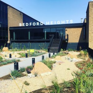
3. Bedford Heights has a lot of outdoor space. How did you go about planning and designing the outside areas?
The Courtyards have remained pretty much the same in terms of layout however I cannot take the credit for these as one of Bedford Heights’ tenants, Graham Pavey, sourced all the planting. I only included the brightly coloured plastic sofas and chairs to bring it alive and welcome people to sit outside.
The only influence I have had is to include as many Texan and tropical plants as possible. The outside space to the front of the new entrance to Bedford Heights has had a complete transformation with engineering and ground levelling to change the whole look. My brief for Graham was to give Bedford Heights a Texan midcentury garden and he has designed a Texan river bed with boulders and pebbles and as many Texan plants as we could cope with given our weather conditions. Some of the plants have been cultivated over a number of months specifically for this area.
Bedford Heights has an exceptional gardener, Dave Boyd, who tweaks and adds to all the planting. It has been a pleasure working with Dave as he is so enthusiastic and together we have worked on some of the indoor planting too.

4. First impressions are very important. What would you like visitors to think when they first visit Bedford Heights?
WOW!
5. Was preserving the heritage of Bedford Heights important to you when planning the redesign?
Most definitely, it is a wonderful midcentury building I have grown to love and have only ever wanted to enhance it and not take anything away from it.
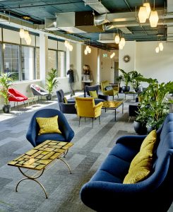
6. The lounges feature mid-century furniture and accessories, not necessarily typical of corporate space; why did you choose to furnish the lounge in pieces from this era?
There are three reasons for this:
1. I knew that Tim Pain, the director of Verve and owner of Bedford Heights, has a passion for Scandinavian midcentury furniture and objects. I did a lot of research and with my own Italian connection fell in love with Italian midcentury pieces instead as these had slightly more flare.
2. The building is from the midcentury and I wanted to recreate the lounge with original pieces that I sourced from various places, including eBay
3. I wanted to make it more homely and less corporate, again to allow everyone in the building to have a place of calm away from their office environments and to lose that office feel. The fabrics are lush velvets and felts which give a warmth and richness to the room. There are two bright red chairs in the lounge that I liken to being the lipstick to an outfit. I often notice people reading quietly or having a meeting which is very pleasing to see. The plants and accessories are also throw backs to the 70s such as cheese plants, palms, birds of paradise and bring the room to life.

For general enquiries:
Tel 01234 244 500
Brickhill Drive
Bedford,
Bedfordshire
MK41 7PH
United Kingdom


